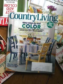
I'm so excited to share that the home feature I styled made the cover story for Country Living magazine, June 2012!
Styling a house for a magazine feature requires a lot of planning.
Editor in Chief Sara Gray and Senior lifestyle editor Natalie
Warady of Country Living magazine loved my scouting shots of the breakfast room and saw the potential for a cover story.
Moving ahead, we discussed what would set the mood for a lovely summer cover.
Moving ahead, we discussed what would set the mood for a lovely summer cover.
Breakfast anyone? After all what's more enticing in June on your getaway weekend than starting
the day with a lovely summer breakfast setting - at a table covered with pretty blue and white linens, glass bottles of happy daisies and all of fixins's of seasonal summer fruit and muffins?
The furniture and
architecture was all there, so in this case it was all about the table top props and styling the table to set the mood. Add to that, the magical work and lighting finesse of Photographer Miki
Duisterhoff and editorial direction of Natalie Warady and we had a recipe for success.
Styling a cover requires creating options and bringing a lot of propping choices. We had many scenarios but
here were two. Check out the subtle changes. Which is your favorite?


The winner is my favorite, too. I like the addition of the yellow chair and how the blue chair on the left side is slighlty opened out to the yellow chair, like I could just slip right in there and be part of the morning conversation.
ReplyDeleteKarin, I love that you share your tips and how-to's to get a great photograph. Congratulations on a cover shot! I was delighted to feature your blog on Stylesson today.
ReplyDeleteKarin: Thanks for the hard work to make a great cover!
ReplyDelete