I had such a nice response to my earlier post on the Cover feature for Country Living magazine, I wanted to follow up with some highlights of the story.
It's all excitement when I get an opportunity to style a home for Country Living magazine, and working on the feature in the current June 2012 feature in Cape Cod was no exception.
It's all excitement when I get an opportunity to style a home for Country Living magazine, and working on the feature in the current June 2012 feature in Cape Cod was no exception.
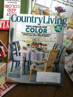 |
| Country Living magazine cover June 2012 |
I had scouted this house with the architect of the home, my
friend, the very talented John Da Silva of Polhemus Savery DaSilva last summer.
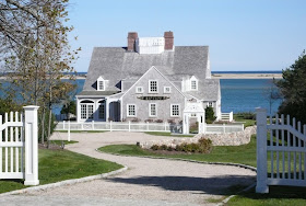 |
| Architect- John Da Silva of Polhemus Savery DaSilva Photo by Brian Van Der Brink |
Loving the historic aspects of the 18th century
house and the way it was renovated for 21st century living, I immediately shared the location
with Natalie Warady at Country Living.
It wasn't long after I set off with a full van to Cape Cod to style and design this feature, meeting CL Editor Natalie Warady and Photographer Miki Duisterhoff.
It wasn't long after I set off with a full van to Cape Cod to style and design this feature, meeting CL Editor Natalie Warady and Photographer Miki Duisterhoff.
Every room, like a set, requires the stylist to portray a story.
The homeowners had described her house in the summer months filled with laughter, summer gatherings of friends and family , and many much favored girls weekends that included a lot of cooking with local seafood and summer produce.
The homeowners had described her house in the summer months filled with laughter, summer gatherings of friends and family , and many much favored girls weekends that included a lot of cooking with local seafood and summer produce.
 |
| The Before Shot |
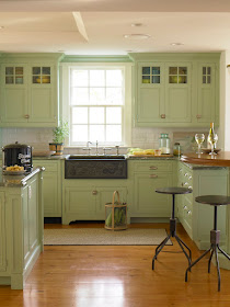
From the before picture you can see how the industrial
bar stools I brought in actually changed the vibe of the kitchen creating a less traditional look. The bar stools echo the black iron sink and together enhance the look. The Simple arrangement of props set the stage for a meal being prepared while still allowing the design of the kitchen to be the dominant feature
The charming bedroom needed a different styling approach.
 |
| Before shot |
We loved the homeowners traditional quilt, but we wanted to create a graphic look with color blocking working off the homeowners pretty pallete for this room. We played with different bedside tables she had in the house.
 |
| Featured shot |
I needed to find vintage linen bedding and I needed it fast! I
sent out an SOS for help via Twitter. Within the speed of
light, I received a response from @tkpleslie, Leslie Carothers. She referred me to Pandora de Balthazár bed linens. The next day, three boxes of Pandora De Balthazár linens arrived! The linens were a perfect fit for this styled shot! Thank you, Leslie!
Here is another of options for the styling of the bedroom. Which is your favorite?
Here is another of options for the styling of the bedroom. Which is your favorite?
I love the details in the house that show the historic past.
And the way John Da Silva created this unique design of whimsical columns flanking the stairs
During our photo shoot, we had first hand opportunity to experience "the girlfriend weekend" while we were there! Not a bad place for a glass of wine!
We had some fun with the girls as Miki Duisterhoff took the group out for a photo shoot on the beach.
 |
| I took this shot of Miki taking her picture of the girls, and Miki took pictures of CL Editor Natalie Warady and me! |






Beautiful house, great styling and a big congrats on your cover!!
ReplyDeleteSuch a warm and wonderful house! Love what you did with the bedroom!
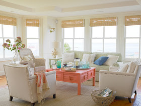
ReplyDeleteLovely! I love all the changes you made, especially the industrial stools in the kitchen and the rustic table in the seating area. Great job!
ReplyDeleteLoved this post, and loved the magazine article--the before and after are so great to see.
ReplyDeleteStacey
www.downtoearthdigs.wordpress.com
That is amazing what a difference your styling made! I like the bedroom in the one you chose to feature better than the other option. Beautiful home (and beautiful work.)
ReplyDelete