lidbeckbrent

lidbeckbrent

Wednesday, May 30, 2012

Creating a cover story- Country Living

I'm so excited to share that the home feature I styled made the cover story for Country Living magazine, June 2012!

Styling a house for a magazine feature requires a lot of planning. 

Editor in Chief Sara Gray and Senior lifestyle editor Natalie Warady of Country Living magazine loved my scouting shots of the breakfast room and saw the potential for a cover story.

Moving ahead, we discussed what would set the mood for a lovely summer cover.
Country Living scouting shot


Breakfast anyone? After all what's more enticing in June on your getaway weekend than starting the day with a lovely summer breakfast setting -  at a table covered with pretty blue and white linens, glass bottles of happy daisies and all of fixins's of seasonal summer fruit and muffins?

The  furniture and architecture was all there, so in this case it was all about the table top props and styling the table to set the mood.  Add to that, the magical work and lighting finesse of Photographer Miki Duisterhoff and editorial direction of Natalie Warady and we had a recipe for success.

Styling a cover requires creating options and bringing a lot of propping choices.  We had many scenarios but here were two. Check out the subtle changes. Which is your favorite?


table setting
Cover try #1

Karin Lidbeck
Cover try #2

And the winner is......


Table setting cover story
Country Living June 2012 

Thursday, May 24, 2012

Build a Rose Bouquet


                                           Country Gardens magazine Summer 2012

In this casual country arrangement, stylist Karin Lidbeck-Brent combines Patience and Juliet roses with fresh- cut lady’s mantle (Alchemilla mollis), hydrangea, Rosa ‘The Fairy’, and white coneflower (Echinacea purpurea ‘Alba’) in a widemouthed white enamel bucket. “Flower arrangements don’t have to look traditional,” Lidbeck-Brent says. “They can be inspired by your garden, where nothing is symmetrical and there’s no rule or order.” Follow these easy steps to create a similar arrangement, choosing a container with an informal country feeling and putting flowers together loosely for a handpicked look.

Step 1: Set a vase into a bucket with a wide opening. Fill both vessels with water to make two arranging rings, which will hold stems in place without a frog or florist’s foam and help create a loose, airy arrangement.

What to use for a vase


Step 2: When choosing flowers, pick colors that work well with each other and with the container, and pay attention to scale and texture. Patience and Juliet roses are dense with petals and up to 4 inches wide when fully open, so use flowers and leaves that complement their large size. Hydrangea and lady’s mantle are ideal companions because they have big heads of small florets that fill space and provide pleasing textural contrast.

roses, daisies, hydrangea


Step 3: Loosely fill the rings, especially the outer one, with stems of hosta and lady’s mantle until you have an airy but full base of greens evenly distributed in the bucket. There should be just enough greens to allow the roses and other flowers with stiffer stems to stand up when you add them. Step back and look at the arrangement.

How to make a pretty bouquet


Step 4: Add six Patience and six Juliet roses, one at a time. Cut each stem to a different length—a little taller or shorter than the greens—just as you are ready to place it. Position roses evenly in both rings, setting each rose slightly apart from the rest so it can fully open. In general, put shorter roses in the outer ring and taller ones toward the center. Although the roses star in this composition, you can tuck a couple of shorter-stem roses deep into the greens to give the bouquet a natural look. Accent your design with green hydrangea and white coneflowers.

Magazine stylist producer DIY design


Step 5: You will know you are finished when the bucket looks full and the flowers lightly touch each other with no large gaps or spaces.

Hydrangea bouquet, daisy, roses, David Austin roses


By Penelope O’Sullivan
Photography by Kritsada 

Produced by Karin Lidbeck-Brent

BHG Country Gardens Summer 2012


Tuesday, May 22, 2012

English Rose Bouquets - Country Gardens Magazine Spring 2012

English roses


 Produced and Styled by Karin Lidbeck-Brent
Photography by Kritsada
Country Gardens Magazine 2012 Summer Issue 


How to decorate with roses


Magazine display of roses


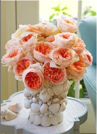
Rose Flower arrangement

vase, tabletop, rose


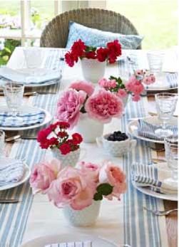
Rose arrangement for table

It was a great day for me last spring when Editor, James Baggett of BHG Country Gardens magazine called me with this awesome assignment, " I want you to create 8 flower arrangements using the glorious David Austin cut roses".  This is the kind of assignment I jump at,..... I happily accepted that job and immediatley got to work.

My to do list:

1. Design 7 - 8 bouquets that represent all 6 varieties of David Austin roses.
2. Order flowers -300 stems of 6 varieties of David Austin roses, gather other shrub roses and    perennials to mix in.
3. Look for a location for photography: a sunny place with a pretty setting inside and out.
4. Decide on containers, props,  and surfaces
5. Gather all materials for the photo shoot, prep all the flowers and head out to our location for photo shoot.

I had the great fortune to work with Kritsada, a Meredith photographer that flew out from Des Moines. We started at 6:30 a.m. to catch the early morning June light.  WE took advantage of the noon high sun for a nice lunch and then worked thru the early evening light.

You can get the entire article with the how to's and all of the David Austin information in the summer issue of Better Homes and Gardens Country Gardens magazines, just out and available on the news stand.


Thursday, May 17, 2012

Treasures from Brimfield


The anticipated May 2012 Brimfield Tweetup at the Brimfield Antiques Fair drew in an amazing crowd! It was tempting to stray away from the antique fair itself, for the line up of talent and inspiring company of designers, bloggers, and decorators in the Tweetup tent was most engaging. Here, you could converse on all aspects of design, including color, decorating, salvaging, antiquing, and trends of the trade.

But the antique fair beckoned and my friend Joanne Palmisano, author of Salvage Secrets, and I had to pull ourselves away and set off for an afternoon of shopping, as I did have a mission.


The idea of venturing into the endless abyss of an antique fair or flea market may seem overwhelming, so the best plan is to have a shopping goal in mind. Having your eyes set on something specific to shop for is always better than anything goes. It helps you edit out the seemingly limitless options, as you can easily overdose on choices.

Floral arranging is my passion. As a stylist, I am always in need of unique bottles and pitchers to house flowers in. At Brimfield, I made my shopping goal to look for small unusual floral vessels for $10.00 or less. Here are a few of my favorite container finds:

One dealer had boxes full of wooden shoe forms. I adored the child size. On the heel of each shoe lays a small, cork-sized hole lined with metal. The hole is the perfect size to hold a few inches of water as well as a few stems. These would look great displayed on your bookshelf or atop a book on any table in your home.

All in all, if it has holes to hold water, it can hold flowers, right? Bingo!


I saw this old electric lamp and fell in love with the textured glass ball shape on top. The electric cord had already been removed which made it a “ready to go” vase and the perfect flea market find.


These old doorknobs make charming little vases, and when paired in threes or more make a delectable collection for any countertop or table.  The cylinder end on each knob holds just enough water to keep a small bundle of lily of the valley or a stem of bleeding heart happy. Of course, the water needs to be refilled daily. 


Joanne has an eagle eye for the unusual. She pointed me in the direction of these fabulous paper milk containers form the 1940’s.  I can't wait to fill these bright colored, summer inspired cartons with the zinnias, cosmos, and heliantus from my garden.


The shopping was fun of course, but the best part of the Brimfield visit was the opportunity to see old friends and make many new.

I was completely thrilled to arrive at Brimfield to be greeted by the wonderful Chris and Walter Chapin of Company C, a sponsor of the Brimfield event and an inspiring home décor and furnishings brand that I have grown to love. Even more thrilled was I to see stacks of copies of the new fall catalog that Chris and I styled in New Hampshire this past winter. It is always a great pleasure to see the finished product of your work.


I was also delighted to meet editor Erin McLaughlin and her fabulous crew from Canada’s Style at Home, interior designer Shane Inman who did a remarkable job designing the Brimfield tent, and I finally got to meet many fellow twitter pals like @abcddesigns, @stylesson and @warrenbobrow1


Tuesday, May 15, 2012

New England Home Magazine Cover Story


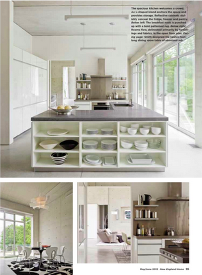
One of the greatest honors I have ever received in my career was when I was offered the position of contributing editor for New England Home Magazine, the premiere regional architecture and interior design magazine in the northeast.  As contributing editor, I am able to style some of the most amazing, breath-taking homes located in all corners of New England.

This previous summer I traveled to Vermont with photographer Jim Westphalen to produce a story on this stunningly simplistic, latter-day home on the Connecticut River. Jim and I are beyond thrilled to have produced the cover story for this month's issue of NEH.


Thursday, May 10, 2012

Create Style: Lilac Centerpiece

A few years back I was sent to the Lilac Festival in Shelburne, Vermont for Country Gardens magazine at the Shelburne Museum.  I worked with photographer Jim Westphalen covering hundreds of Lilac varieties and shooting the grounds abundant with lilacs trees.

With masses of lilacs available to us, I created this table top centerpiece on our shoot.

You can make this:
Old Vintage crates or wood boxes are fabulous containers for flowers, especially larger blooms, like lilacs. Fill the crate with large jars or plastic containers of water. Place a large hurricane in the center. Add the lilacs and anything else that is growing in the garden like Pansies, Tulips or flowering branches.


Cutting the lilacs: To get the most longevity from your cut lilacs: cut the bottom of the woody branch with a sharp knife slicing vertically for a few inches down the stem exposing the center of the branch that drinks the water.

Learn about The Shelburne Museum Lilac Festival: Shelburnemuseum.org

Tuesday, May 8, 2012

Make this: Dishtowel vase! Country Gardens Magazine


Hurray! Lillies of the Valley are blooming!  Gather a bunch to style this fun display. Its fragrance can’t be missed. 


You can make this charming  flower sack  that I created for Better Homes and Gardens Country Gardens magazine !

Grab a pretty dishtowel, a zip lock bag, clothesline, and clothespins to hang bundles of fragrant white Lillie's in your window. The dishtowel bag is lined with a zip lock bags that holds the water to keep the flowers fresh and alive.

Designed by Karin Lidbeck Brent, Photo by Jim Westphalen

To make the bag:


Use a small sandwich size zip lock bag.  Open dishtowel on table vertically in front of you. Fold in half.  Lay the zip lock bag on top of the dishtowel matching the bottom edges.  Cut the dishtowel 1/8 inch longer all around the bag. Use pinking sheers to cut edges.

Place the opened zip lock bag inside the cut dishtowel; Use a stapler to staple the dishtowel and the bag together.  Place  staples down the outside edges catching the bag inside the dishtowel. 

With bag open, staple across the front top edge and back top edge of bag and dishtowel together

Hang clothesline across your window. Use 1 clothes pin on each corner to hang bag from small clothesline.
Use a small spouted container like a measuring cup to add water to bag, fill just quarter to half of bag.
Add flowers.

Thursday, May 3, 2012

Pink Design Accents Turns a Neutral Room to WOW


Styling a room for a photo shoot is a lot like spring cleaning.    Take it all out for a good cleaning, and then, look with a fresh eye. Your instincts will direct you to do something different. Add a zing of color, freshen with new pillows,  rearrange your displays, add new exciting accessories, even rearrange the art.
Country Living magazine
Styled by Karin Lidbeck Brent


In this room for Country Living magazine,  I brought in this colorful contrasting rug with pink flowers to ramp up the excitement for the neutral  palette. The rug replaced a tan sisel rug.  Drawing from the colors of the rug, it was fun to echo the pinks and red with accessories.

Adding floral arrangements always adds a statement to a room.  If you are not using the room to entertain, oversize bouquets will dramatize a room. When using the sitting area move it to a side table.


Wednesday, May 2, 2012

Hibiscus adds Drama to Styled Room- Country Living magazine

Country Living Magazine

This sunny window in the hallway sets the scene for a super simple but dramatic display with trailing hibiscus.

An oversized basket is the perfect container, just plop a potted plant in!

Unlike cut flowers, there's no fuss and it will last for months, but don't forget to water once a week.

I love the informal relaxed feeling it gives to this country home I styled for Country Living magazine.

The gorgeous blooms breathes life into this space. Imagine how different this space would have look without it!


Tuesday, May 1, 2012

Styling Pressure- A One Day Room Makeover

Photo by Michael Partenio 
This one day room makeover was one challenge that required a lot more than adding flowers.


A photo stylist has many challenges on a photo shoot: 


Like a set designer, I redirect the color palette,  rearrange displays, change/add furniture, add/take away accessories,  create floral arrangements, create a mood, or create a lifestyle story.  All of these things happen on set, usually with an incredible pressure to recreate a room with lightening speed, 8-10 shots a day is the minimum.


I styled this beautiful seaside home for Renovation Style magazine. This one important room with beautiful architecture had never been resolved.
The Before


On a shoe string budget and a tight schedule I had to completely redesign the room the day before the shoot turning a dining space with a vintage couch into a living room.

You can see the results of many quick trips to various home design stores and an enthusiastic Ethan Allen store that was willing to lend us the couches and chairs.

The homeowner kept it all.

And then, by the way, the picture made the cover of the magazine!